Double confirmation: to be or not to be?

Users make mistakes and this should be a given when doing UX. Designers should try to accommodate for that and make is as uncomplicated as possible to navigate such cases.

It is, however, not black and white, and no one solution fits all. Currently I am working on a software in which a user mistake can trigger events which may be hard or impossible to reverse (emails sent out to clients, change of access or ownership of an item, etc.). I noticed there are three general approaches to dealing with user errors. This all depends on the severity of the consequences of the error and recoverability.
An omnipresent example of such errors is deleting something, so I will use it to illustrate the options. Those options can generally be easily translated to other areas.
Level 1: No confirmations, no undos.
Imagine a to-do list functionality. It is bound to happen that a user will tap on one task instead of another and mark it as complete. Happens. The mistake is usually noticed fast enough, and is easy to fix, by tapping on a “done’’ task to undo it.

Level 2: A confirmation, an undo, and an (equivalent of) trashbin
Then, there are actions which have more implications if they are done by mistake: sending an email, deleting a file, transferring money. In such cases there are various ways to augment the second level of confirming if the user wants to perform the action:

- Asking the ‘Are you sure’ question requiring an explicit agreement from the user (I could not find any research base on this, but it is a recurring topic that it just becomes a habit to click OK on such confirmations. After all, in most of the cases the user does not make an error, so second confirmation becomes a learnt behaviour and in the end does not serve the original purpose). Nice piece on this topic is Never use a warning when you mean undo.

- Having the user tick an extra checkbox, select an action from a dropdown and then confirm and other odd solutions. I’ve seen these only in internal applications or intranets, where more often then not the approach is “We can teach the users how to use it”.

- Providing an Undo option. Now we’re getting somewhere. After you, (habitually confirming deletion) did remove your favourite cat photo, you can select an Undo action from within a notification confirmin the deletion. It requires a bit more tweaking with things like, say, sending out emails, or turning over ownership of documents. Specifically, a timeout has to be set before the actual action is performed by the system, enabling the undo. In such timeout cases a variation of the undo can be showing a prolonged (i’m talking a couple of seconds) animation of the action being performed. This tends to give that extra moment of awareness of the action to the user, and, potentially, a possibility to abort whatever is happening. These Undo variations are useful for situations like ‘Oh no, I meant to delete the dog photo, not the cat photo!”.
These several moments after the action is done are very frequently enough to spot the error. So frequent that there is apparently a slang word for that: the Oh no second
- Providing a trashbin, or another temporary container for deleted items. This one serves more the purpose of people changing minds later. Also useful, but a bit outside of the current topic of accidental mistakes.
Level 3. No chance for accidental actions
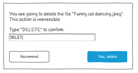
And then there are actions which you don’t want to happen without a complete, all-encompassing, total awareness of the user that they are performing a very important, full of consequences, potentially impossible to reverse action. Think of managing client databases, registering data in a governmental office, or posting something on Facebook at 4 in the morning.
In those cases you often see that the user is asked to perform an action that goes out of the usual pattern. I’d opt for choosing actions which increase awareness or are somehow related to the action that the user is trying to do. Meaning, instead of entering a sum of 15+7=… , typing out the “Delete’’, or, even better, name of the item they are trying to delete draws more attention to what is happening.

More often than not, a designer is working for a client, and at times (s)he has explain the choices. Depending on the software application, some clients tend to insist on the Level 3 confirmations, when Level 2 is more than enough. The discussions whether and in which extent the errors are dangerous can get really abstract really quick.
One argument which seems to work to convince to choose for undos instead of the double confirmation is the following:
Let’s assume 95% of cases the user does not make a mistake. When using double confirmation, the standard amount of steps they take is 4. Besides using extra time to perform the second confirmation in 95% of the time AND being a habit (thus, oftentimes not actually) preventing errors, it is much more useful and user-friendly to choose for the Undo option.

Another thing to deal with is, of course, ease or complexity of building this feature. At times, the effort-impact analysis of implementing of an Undo is just not feasible, and the good old ‘Are you sure?’ trumps an Undo. But even then, there are ways to make the confirm modals more user-friendly. That is, perhaps, a topic for a different post :)
